

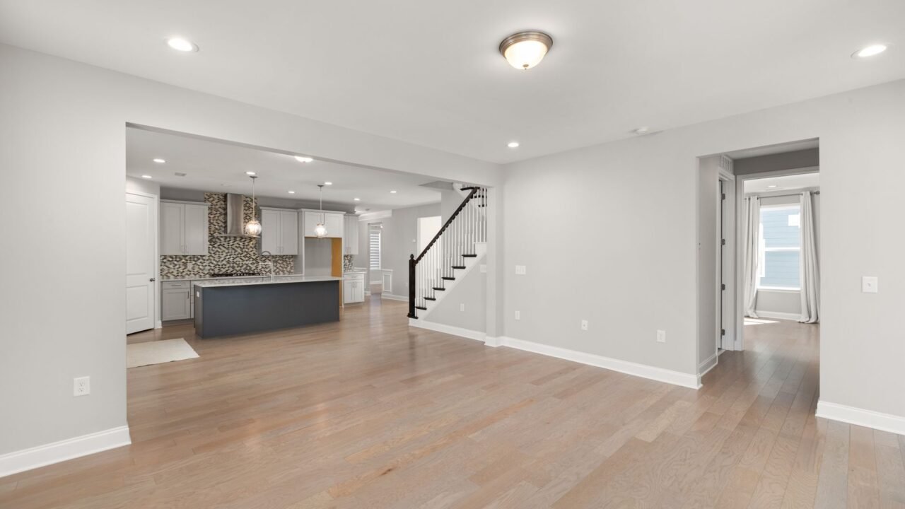
Open floor plans create a sense of flow between rooms, but that same openness makes color choices more complicated. A palette that works beautifully in a single closed room can feel disjointed when the kitchen, dining, and living areas are all visible from one spot.
Think of the Whole Space as One Room
The first step is mentally treating the open area as a single large room rather than several small ones, even if each zone has a different function. Colors chosen for the kitchen need to feel intentional next to whatever is chosen for the adjoining living area.
Pick One Neutral as the Foundation
Choosing a single wall color, or a very tight range of similar neutrals, for the entire open area creates a consistent backdrop that lets furniture and accessories do more of the visual work. This does not mean every zone has to look identical, just that the walls do not compete with each other.
Use Accent Colors to Define Zones
Once a base neutral is set, accent colors through furniture, rugs, and accessories can help distinguish one zone from another. A dining area might lean into a deeper accent tone through chairs or artwork, while the living area uses the same accent color in smaller doses through pillows or a throw.
Repeat at Least One Color Across All Zones
Carrying a single accent color through each zone, even in small amounts, ties the whole space together visually. This could be as simple as using the same shade of green in a kitchen plant, a living room pillow, and a piece of dining room art.
Consider How Light Moves Through the Space

Open floor plans often have light entering from multiple directions at different times of day. Testing paint samples in each zone, at different times, matters more here than in a single closed room, since a color that looks right in the morning kitchen light may shift under afternoon living room light.
Keep Trim and Ceiling Consistent
Using the same trim and ceiling color throughout the open area, even if wall colors vary slightly by zone, reinforces the sense that this is one connected space rather than a patchwork of separate rooms.
Test Before Committing
Painting a large swatch, at least two feet by two feet, in each zone and living with it for several days reveals far more than a small chip ever can. Open floor plans are especially unforgiving of a color choice that seemed right in the store but reads differently once it covers dozens of feet of connected wall space.
Undertone Pitfalls Across Lighting Conditions
Paint colors that look neutral in a paint store or on a screen often reveal a warm or cool undertone once applied across dozens of feet of connected wall in an open floor plan. A gray that reads as a true neutral in bright north-facing light can shift noticeably green, blue, or purple under warm incandescent bulbs in the evening, an effect that becomes more obvious the more wall space a single color covers. This is one of the main reasons open floor plans are less forgiving of an untested color choice than a single, smaller closed room.
Testing swatches at three different times, morning, midday, and evening with the lights on, catches most undertone surprises before a full gallon is purchased. Comparing a swatch directly against existing flooring and cabinetry, rather than in isolation, also reveals clashes that are easy to miss when a color chip is viewed on its own against a white background.
Coordinating Flooring and Cabinetry Across Zones

An open floor plan often carries a single flooring material across the kitchen, dining, and living zones, which simplifies color planning considerably compared to homes where each zone has different flooring underfoot. When cabinetry, flooring, and countertops in the kitchen zone have warm undertones, oak cabinets or warm-toned countertops, for example, a paint color with a similar warm undertone throughout the connected space avoids the visual tension of warm and cool tones competing across an open sightline.
Where flooring and cabinetry were chosen separately and now clash slightly in undertone, a neutral paint color that splits the difference, neither strongly warm nor strongly cool, often mediates between the two better than doubling down on either direction.
Common Mistakes in Open Floor Plan Color Planning
The most common mistake is treating each zone as its own separate design project, choosing a color scheme for the kitchen and an entirely unrelated one for the living area without considering how both will look from the same vantage point. Since open floor plans are, by definition, viewed as a single space from many angles, colors chosen in isolation frequently look disjointed once the walls are actually painted.
A second common issue is over-relying on small paint chips rather than large test swatches. A two-inch chip simply cannot convey how a color will read across an entire connected wall run, and committing to a full room based on a chip alone is one of the more expensive mistakes to correct after the fact.
Working With Furniture and Existing Finishes
An open floor plan’s color palette also needs to account for any furniture, rugs, and finishes that are staying in place rather than being replaced. Pulling one or two accent colors directly from an existing rug or a piece of art, rather than choosing an entirely new palette from scratch, often produces a more cohesive result and avoids the expense of replacing furnishings that already work perfectly well.
A Practical Testing Process
Rather than painting small swatches directly on the wall in multiple spots, which can leave patchy marks if a color is rejected, painting large sample boards, at least two feet square, on foam core or poster board allows the same swatch to be moved around the space and viewed against different walls, lighting conditions, and adjacent finishes without any commitment. Propping these boards near the kitchen cabinetry, the living room windows, and the dining area in turn reveals how a single color performs across the full range of conditions an open floor plan presents.
Living with these boards for at least three to five days, checking them in the morning, midday, and evening, provides a far more reliable basis for a final decision than a same-day impression, since undertones that seem subtle on day one sometimes become more noticeable once the initial impression fades.
Choosing Accent Colors That Age Well

Because a neutral base color is expensive and disruptive to repaint across an entire open floor plan, it is worth choosing something with genuine staying power rather than a color tied to a specific, fast-moving trend. Accent colors introduced through furniture, art, and accessories are far less costly to update as tastes shift, which makes them a better outlet for a bolder or more current color choice than the walls themselves.
A useful test for whether a neutral will age well is to picture it against several different accent color schemes, a cooler blue-and-white scheme, a warmer terracotta scheme, a more monochrome scheme, and check whether the base neutral still looks intentional against each. A neutral that only works with one narrow accent palette is more likely to feel dated once that particular trend passes.
Sheens and Finishes Across an Open Space
Paint sheen matters more in an open floor plan than in a closed room, since a kitchen zone typically benefits from a more washable satin or eggshell finish while an adjoining living area is often painted in a flatter matte finish for a softer look. Using the exact same color in two different sheens across zones, rather than switching to a different color entirely, keeps the transition from kitchen to living area feeling seamless while still giving the kitchen the added durability and cleanability it needs near cooking and food prep. A slight sheen difference is far less noticeable than a color change, and most people will not consciously register it at all.
Testing Colors Under Real Lighting Before Committing
An open floor plan raises the stakes on color testing considerably compared to a single closed-off room, since a color mistake is visible from multiple angles and multiple adjoining spaces at once rather than being contained behind a door. Paint swatches viewed on a small card at a store, or even a small painted square on a wall, rarely represent how a color will actually look once applied across a large open area under the full range of lighting the space receives throughout the day. Painting a larger sample, at least a two-foot square, on two or three different walls that receive different amounts of natural light, and observing it in the morning, midday, and evening, reveals shifts in undertone that a small swatch simply cannot show. Colors that look neutral in bright midday light can take on a noticeably warmer or cooler cast under evening lamp light, which matters enormously in a large connected space where that shift is visible from every angle.
It also helps to think about how a chosen palette transitions between the different functional zones within an open floor plan rather than treating each zone as an isolated room. A palette that works well in a kitchen area might feel harsh or clinical when it extends uninterrupted into an adjoining living area meant to feel more relaxed, which is why many successful open floor plan palettes use a single wall color as a connective base throughout, then differentiate zones through furniture, textiles, and accent colors rather than through wall paint changes that would otherwise feel disjointed when there is no door or wall to justify the transition.
Related Reading
- 12 Simple Ways to Make a Small Living Room Feel Larger
- How to Layer Textures for a Cozier Living Room
- Simple Styling Tricks for Shelves That Look Curated
- Dopamine Decor: The Viral Color Trend That Turns Mood Into a Design Tool
- Limewash Walls Are Trending: What the Textured Paint Look Actually Requires
Frequently Asked Questions
Should every zone in an open floor plan use the exact same wall color? Not necessarily. A single base neutral throughout, with one zone using a slightly deeper or richer version of that same color family on an accent wall or island, can add definition without breaking the overall cohesion.
How does natural light affect zone-to-zone color consistency? A zone with significantly more natural light than another, a kitchen with large windows next to a more enclosed living area, for example, can make the identical paint color appear to be two different shades. Testing the same color in both zones before committing helps catch this.
What if the ceiling height changes between zones in an open plan? Keeping ceiling color and trim consistent even where ceiling height changes helps unify the space visually, since a sudden shift in ceiling treatment can feel like a break between zones even when wall colors match.
A Palette That Grows With the Space
An open floor plan rewards a restrained, cohesive color approach more than a bold one. Building the palette around one strong neutral, one repeated accent, and consistent trim gives every zone room to have its own character while still reading as part of the same home. Once the palette is set, layering in texture through rugs, pillows, and natural materials is what keeps an open floor plan from feeling flat; see our guide to layering textures for a cozier living room for ideas that work well against a neutral, cohesive backdrop.









1 Comment